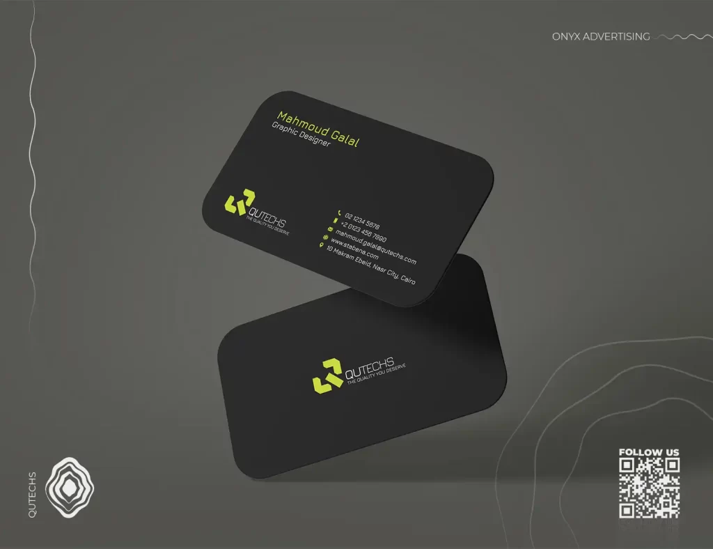
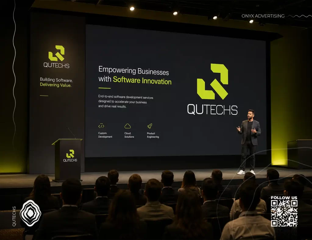
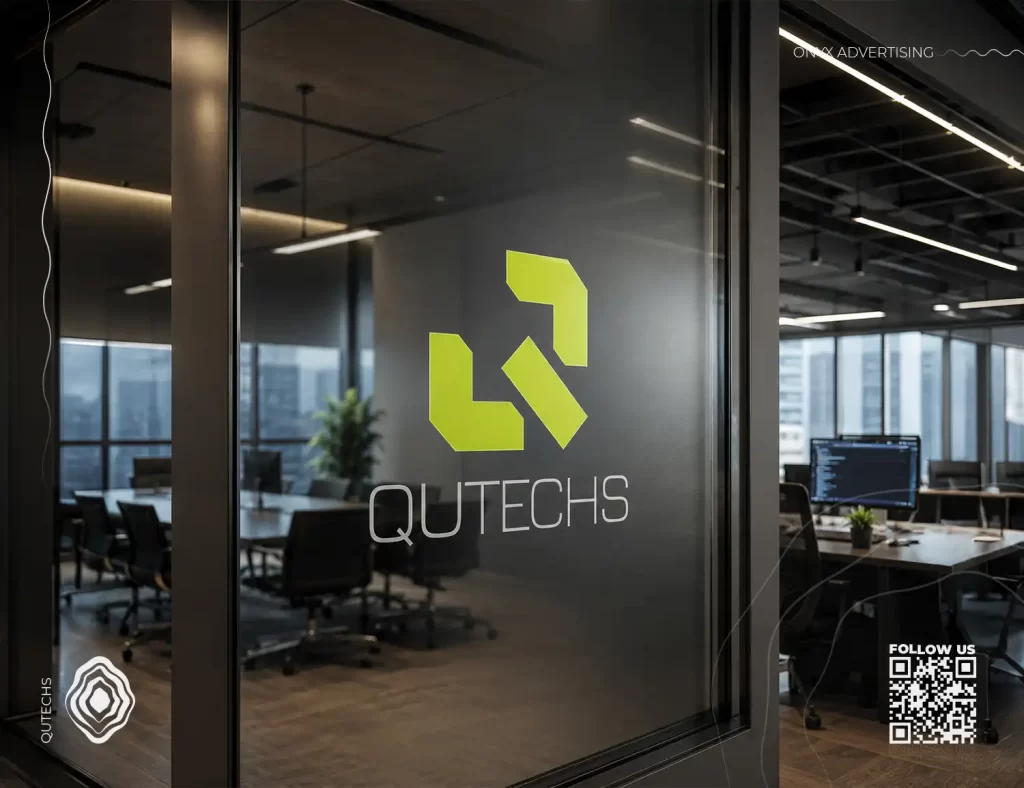
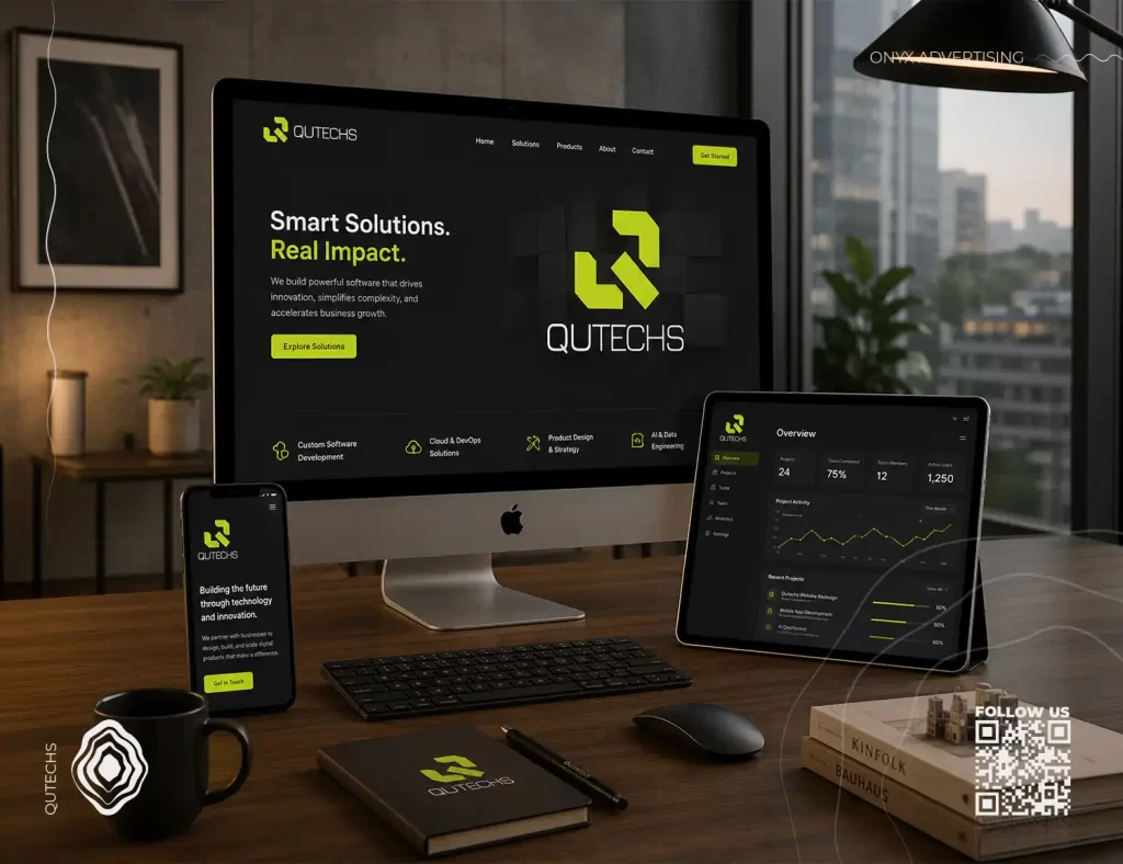

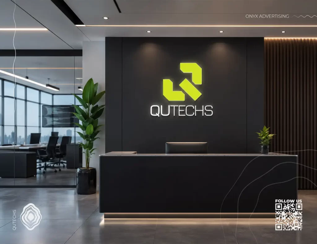
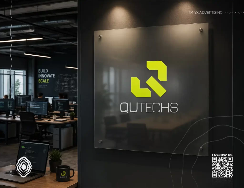
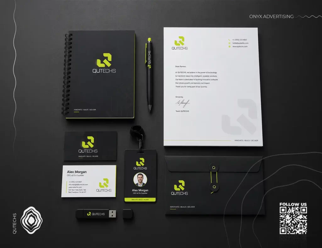
The QUTECHS logo is inspired by the letter Q, reimagined through geometric forms that reflect the visual language of programming and coding symbols such as < > / . The icon is built from sharp, modular shapes that resemble code brackets, digital blocks, and connected system components.
This concept reflects the company’s identity as a software-driven brand focused on development, structure, logic, and innovation. The fragmented yet connected shapes represent how QUTECHS builds digital solutions by connecting ideas, systems, data, and users into one efficient technology experience.
The neon green color communicates innovation, energy, technology, and forward-thinking, while the dark background gives the brand a modern, premium, and professional software identity.